
“The Value-Adoption Matrix is a way to find high-impact opportunities hiding in features you’ve already built, by plotting each feature on two axes: how much customers value it, and how many actually use it. The valuable-but-underused features in the top-left are the untapped opportunities, and they fall into three types: features customers don’t know exist, features that are too hard to use, and features one segment loves that look unpopular in the aggregate. Because roughly 90% of the work on these features is already done, fixing them lifts activation, conversion and retention for a fraction of the developer time a new feature costs. You measure adoption with product analytics and perceived value with a pairwise ranking survey, then plot the two together. It was developed at OpinionX.”
What is the Value-Adoption Matrix?
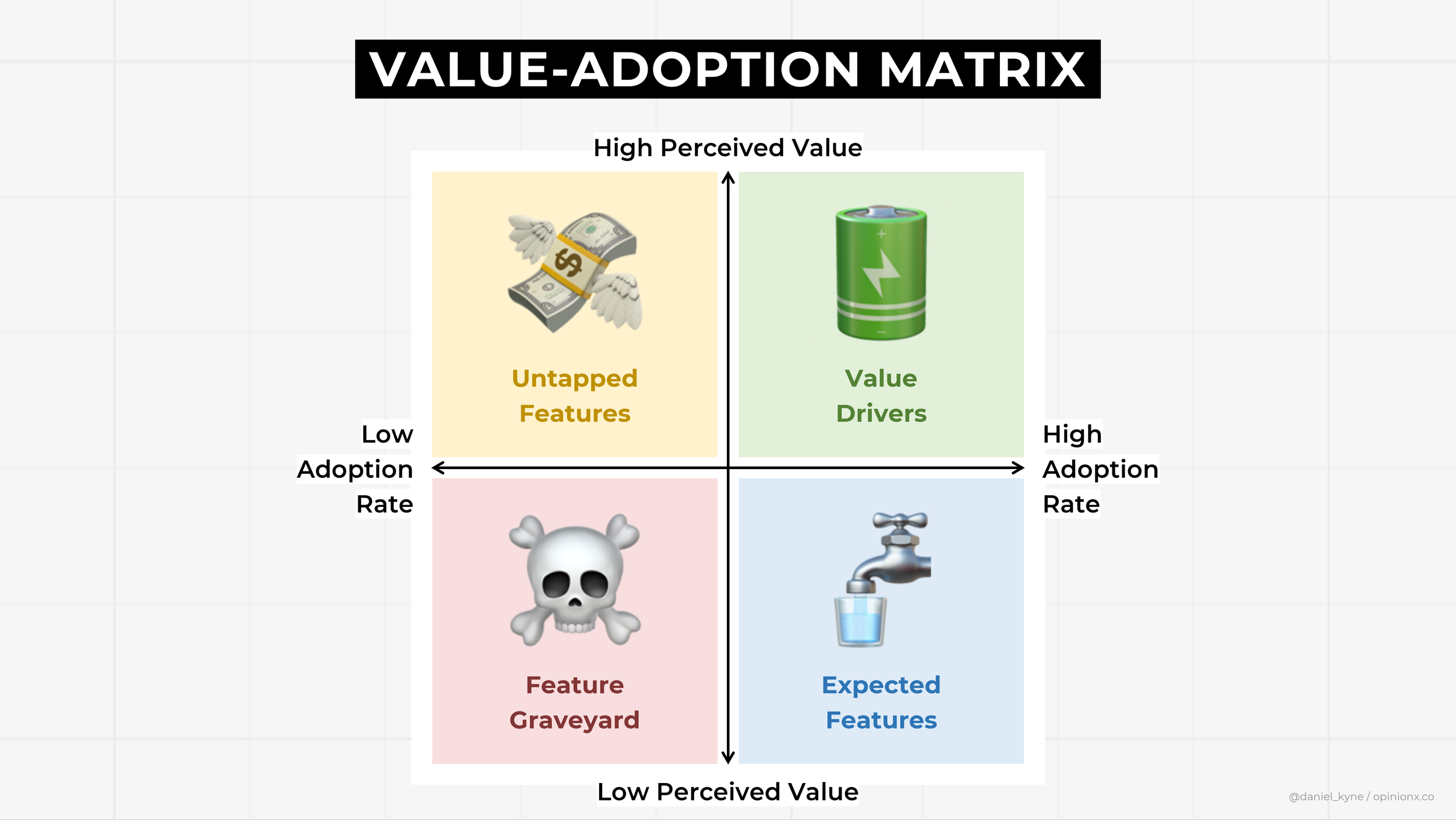
The Value-Adoption Matrix is a two-by-two framework that plots your existing features by customer-perceived value against actual adoption rate, to reveal which underused features are worth investing in rather than abandoning.
Building new features is a risky use of your time, since a product feature only earns its keep if people use it. Pendo's Feature Adoption Report found that around 80% of features in the average software product are rarely or never used (Pendo, 2019). So teams keep building new things to lift activation, conversion and retention, when the metrics they're chasing are often already sitting in features they shipped months ago.
Most teams have an untapped goldmine of existing features and don't realise it. The Value-Adoption Matrix is how you find it.
To check whether you're one of those teams, answer three questions:
What's the adoption rate of my existing features?
Which features are most important to my customers?
Which important features are used least?
A feature customers find valuable that isn't widely used is an untapped opportunity, and it's usually one of three things:
Undiscovered: most customers don't know it exists.
Poorly designed: customers find it unusable.
Segment-specific: one segment cares a lot about it, which the aggregate hides.
Roughly 90% of the work on these features is already done, so finding them can lift your key metrics with far less developer time than chasing new features. The rest of this guide covers how to find them and work out which of the three types each one is.
How is the Value-Adoption Matrix different from the Kano Model?
They get grouped together because both weigh how much customers care about features, but they answer different questions at different stages.
The Kano Model classifies proposed or existing features by the kind of satisfaction they create: basic expectations, performance features, and delighters. It tells you what category a feature falls into, so you can decide what's worth building or improving.
The Value-Adoption Matrix does something narrower and more operational. It takes the features you've already shipped and finds the ones customers value but aren't using, so you can fix the gap rather than build something new. It's a diagnostic for an existing product surface, not a classification of feature types.
So they complement rather than compete. Kano tells you what kind of value a feature offers; the matrix tells you whether a valuable feature you already have is actually reaching people. You can run the matrix to surface an underused feature, then use Kano thinking to work out whether it's an unmet basic expectation or an untapped delighter.
1. What's the adoption rate of your existing features?
You'd be surprised how many customers don't know about the features you already offer. Pendo found that an average of 12% of features generate 80% of daily usage (Pendo, 2019), which is the Pareto principle showing up in your product.
Feature adoption is a relatively easy stat to collect. Most product analytics platforms track it directly: Amplitude, Pendo, Heap and June all have feature-adoption reporting. Pull the list of features and their adoption rate into a spreadsheet. (If you don't have feature-adoption analytics, there's an alternative approach at the end of this guide.)
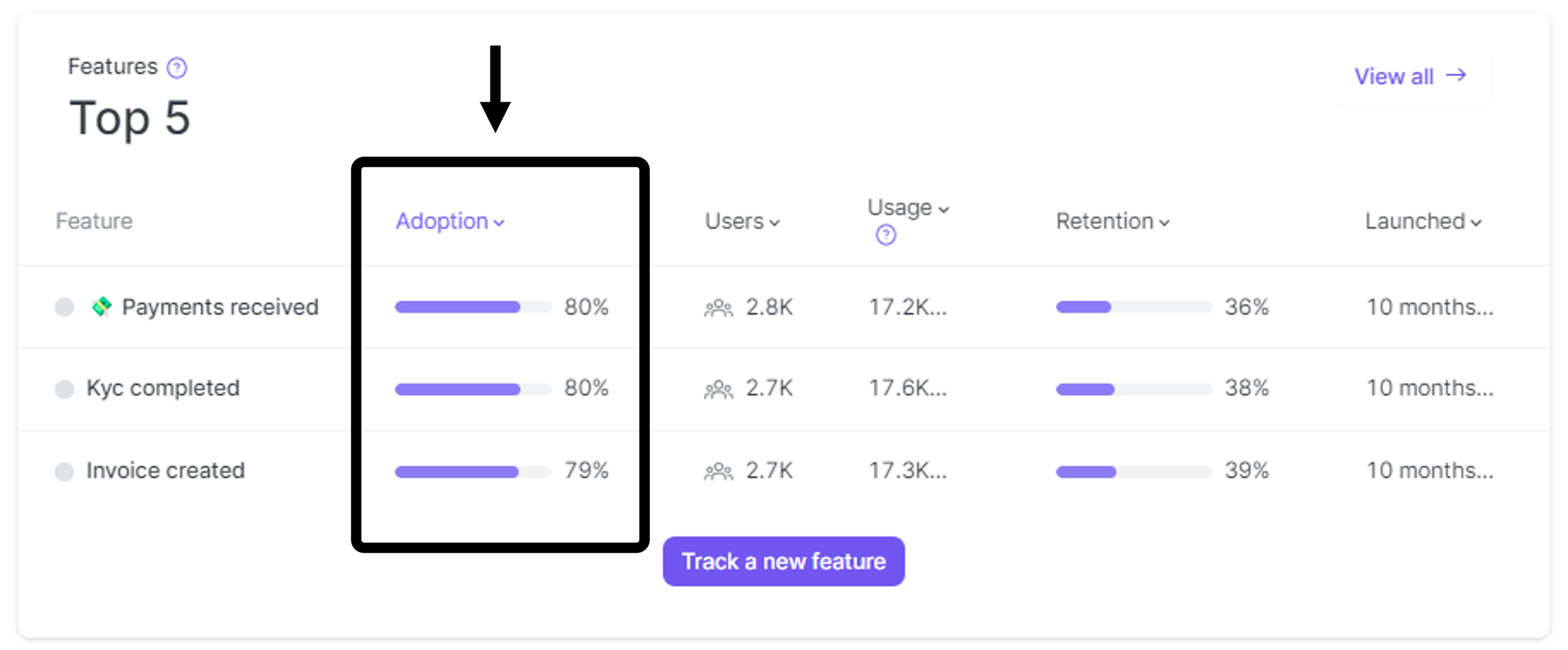
Example “Feature Adoption Rate” report on June.so
2. Which features are most important to your customers?
Now measure how much customers value each feature. The trick is to translate features into the capabilities they give customers, because people care about what a feature lets them do, not the feature itself.
Take a "feature adoption report" feature. The capability it enables is "measure the percentage of customers that used a feature in a given period". The less jargon, the better; our guide to writing capability statements covers how to phrase these cleanly. One feature can map to several capability statements, which is fine.
To measure perceived value, use a pairwise ranking survey. It shows customers your capability statements in head-to-head pairs, asking "if our product could only do one of these things for you, which would you pick?". At the end you'll see which statements win the highest percentage of pairs, which are your highest-value capabilities according to customers.
Pairwise works better than asking people to rate each feature because it forces a trade-off. Ratings cluster at the top and tell you nothing, which is central tendency bias; pairwise makes people choose.

3. Which important features are used least?
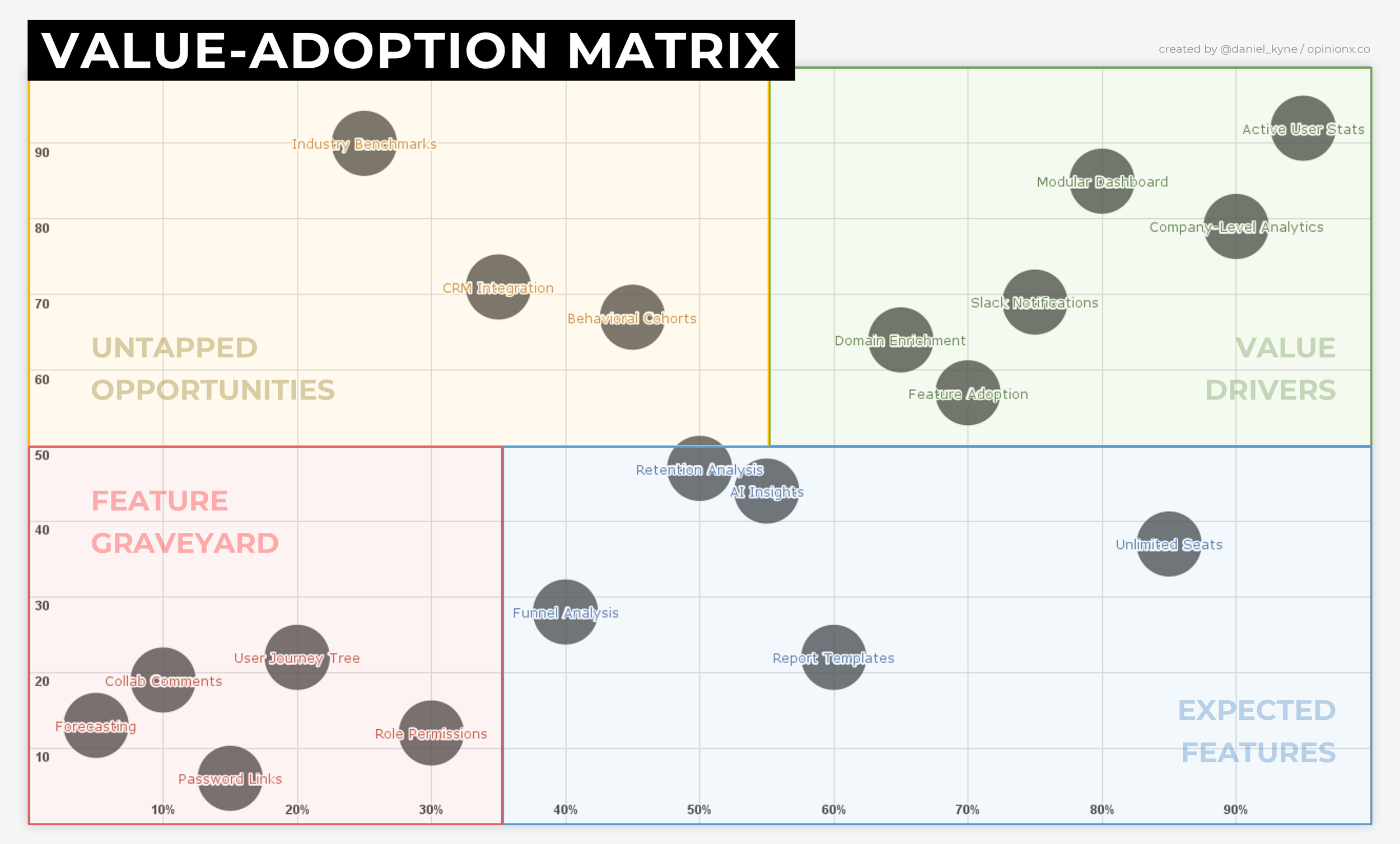
Once the pairwise survey is finished, export the results into your spreadsheet. You should now have a table with four columns: Feature, Capability Statement, Adoption Rate, and Perceived Value Score. Turn it into a scatter or bubble chart.
The untapped opportunities are easy to spot in the top-left quadrant: high perceived value, low adoption. The harder part is working out why each one is stuck there, which is the three opportunity types.
Type i: An undiscovered feature customers don't know about
Some features have low adoption because users don't know they exist. Fixes range from updating your information architecture so the feature sits where people expect it, to lighter touches like hotspots and tooltips on newly launched features. More on this in the case study below.
Type ii: A poorly designed feature customers find unusable
Sometimes a feature has poor adoption because it's too hard to use, or limited in ways that stop users getting the full benefit. Unmoderated user tests, session-recording tools, or just watching a few users try to find and use the feature on a call will surface a design problem fast. Plenty of the European research tools do this if you need one.
Type iii: An add-on a specific segment cares about
The aggregate value-adoption chart won't show you that some features with low overall adoption have high adoption within a specific segment. This matters because a feature with segment-specific adoption is a strong candidate to repackage as a paid add-on for incremental revenue.
Segment-specific adoption can be tricky to see in product analytics, but the perceived-value data is easy to segment. Take your pairwise results and apply a segmentation filter to isolate users by job title, geography, company size or use case. Set those filters up by asking a multiple-choice question alongside the pair voting. This is the same needs-based segmentation logic applied to features rather than problems, and crosstab analysis handles the more involved cuts.
Case study: how we used it on OpinionX
We studied our users' perceived value toward the main features in OpinionX. Our highest-retention customers saw segmentation as a very valuable capability, but most of our paying customers didn't know we had a segmentation feature at all.
Before this research, segmentation lived in one place: a tiny icon at the top of each results table, and activating it applied only to that one table.

Based on the insight, we:
Turned the tiny icon into a larger button with a text label, so it was easier to notice.
Extended segmentation to apply across all your results, not just one table.
Added a floating button to make clear that segmentation is the primary analysis method.
Let users click any multiple-choice graph to activate a segmentation filter instantly.
Added a paywall with an embedded video explaining why segmentation is valuable.
We made a key feature easier to discover, more useful once adopted, and clearer for free users to see why it was worth upgrading for. Months later we were still expanding segmentation off the back of that one project. It's a textbook top-left find: high value, low adoption, undiscovered.

Building the matrix without feature-adoption analytics
If you don't have feature-adoption analytics, you can use stated-usage data instead. With a multiple-choice question, show each feature with usage options for the past month or quarter: never used, rarely used, moderately used, continuously used. Export that and plot it against the perceived-value pairwise results to build the chart.
Stated usage isn't as reliable as analytics data and asks more of participants, but it's a workable alternative for early-stage teams without an analytics setup.
The mistake to avoid: untapped opportunities versus graveyard features
The easiest mistake here is wasting time optimising low-value features. If customers perceive a feature to offer low-value capabilities and it has tiny adoption, kill it. This is the flip side of our argument that startups should run a problem-focused roadmap: adoption data alone can't separate a hidden gem from a graveyard feature, and you need the perceived-value axis to tell them apart. If in doubt, talk to users about why they hold the opinions they do.
That's the whole point of adding the value axis. Adoption tells you what people use; value tells you what they'd miss. Only together do they tell you what to fix.
Frequently asked questions
What is the Value-Adoption Matrix? The Value-Adoption Matrix is a two-by-two framework that plots your existing features by customer-perceived value against actual adoption rate. The valuable-but-underused features in the top-left quadrant are untapped opportunities worth investing in. It was developed at OpinionX.
How is it different from the Kano Model? The Kano Model classifies features by the type of satisfaction they create (basic, performance, delight) to decide what to build. The Value-Adoption Matrix diagnoses features you've already shipped to find valuable ones customers aren't using. Kano classifies; the matrix finds gaps in an existing product. They complement each other.
How do you measure perceived value? With a pairwise ranking survey. Customers see your features, translated into capability statements, in head-to-head pairs and pick which they'd keep. The statements that win the most pairs are the highest-value capabilities. This forces a trade-off, which a rating scale doesn't.
What are the three types of untapped opportunity? Undiscovered features customers don't know exist, poorly designed features customers find unusable, and segment-specific features that one group values highly even though overall adoption looks low.
What tools do you need? A product analytics tool that reports feature adoption (Amplitude, Pendo, Heap and June all do), and a pairwise ranking survey tool for the perceived-value axis. If you have no analytics, stated-usage data from a multiple-choice question works as a substitute.
The Value-Adoption Matrix works because adoption alone lies to you. A feature can be unused because it's worthless or because nobody's found it yet, and only the value axis tells you which. Plot both, look top-left, and fix what's already 90% built before you build anything new.
Want more like this? Over 42,000 researchers and product people get The Full-Stack Researcher in their inbox. Subscribe for the next one.
The Value-Adoption Matrix pairs neatly with customer problem stack ranking: one ranks the problems worth solving, the other ranks the features you've already built to solve them. You can run the perceived-value survey on OpinionX for free: $0, unlimited surveys, unlimited researcher seats, capped at 25 participants per survey, then $900 a year to lift the cap (full pricing). Rank your capability statements, then segment the results to see which features each customer group values most. Create a ranking survey.