
Crosstab Analysis: Explanation, Examples, Methods, Advantages, Use Cases, Tools
What is Crosstab Analysis?

A crosstab is a table that lets you compare two or more types of data to see how often they overlap. It’s commonly used in surveys to see how often two different answers appear in the same respondent profiles.
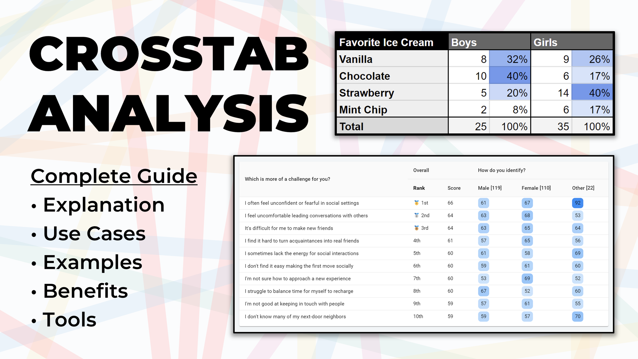
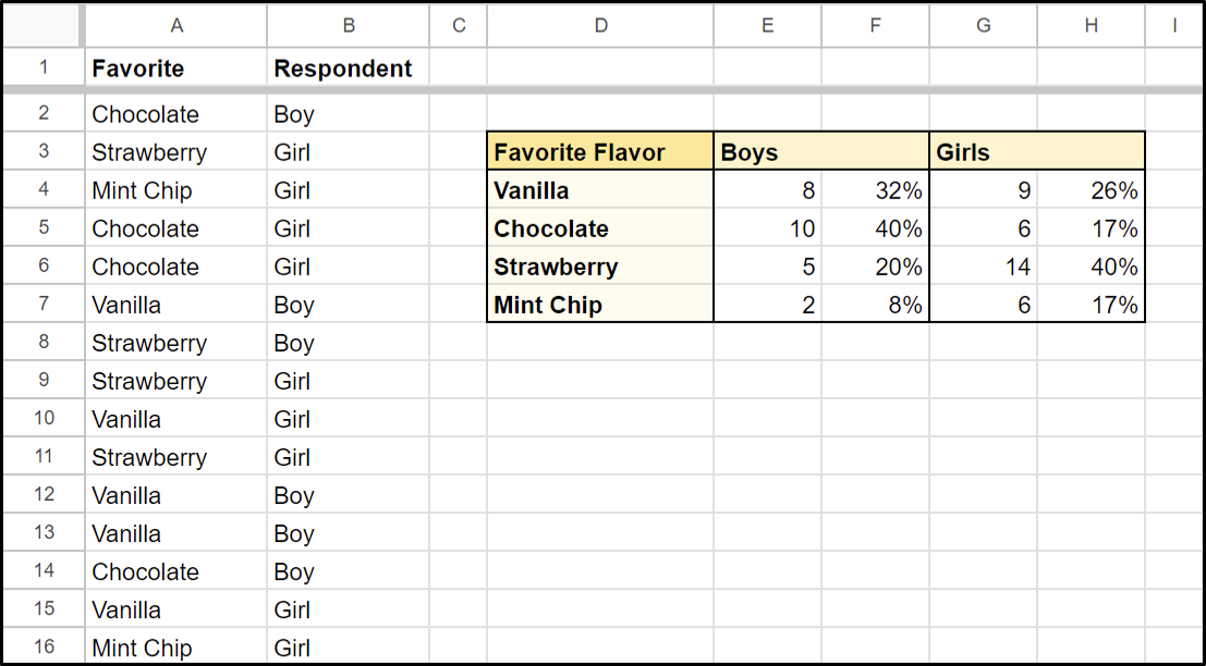
Consider a scenario where you’ve just surveyed a bunch of kids about their favorite ice cream flavor and now you want to see whether there was a big difference in answers for boys versus girls. Rather than counting each answer up manually, you can create a crosstab table that shows a breakdown of exactly that.
By calculating the percentage for each cell, we can instantly see that boys like chocolate ice cream most and girls prefer strawberry ice cream. If we had relied only on the overall results, we would’ve assumed strawberry was the best choice overall, not realizing that 80% of boys had not selected that option.
This is a pretty basic example, but it shows us how easily crosstab analysis surfaces differences in survey results depending on the subgroup of participants you focus on, helping you identify relationships that exist in your data that are often not obviously apparent when looking at your aggregated results.
While “crosstab” is short for “cross-tabulation analysis” (which sounds very complicated), all it really means is to put two things across from each other on a table to see how they overlap. Whenever you want to compare how variables in a dataset influence one another, crosstab is a great analysis method to consider.
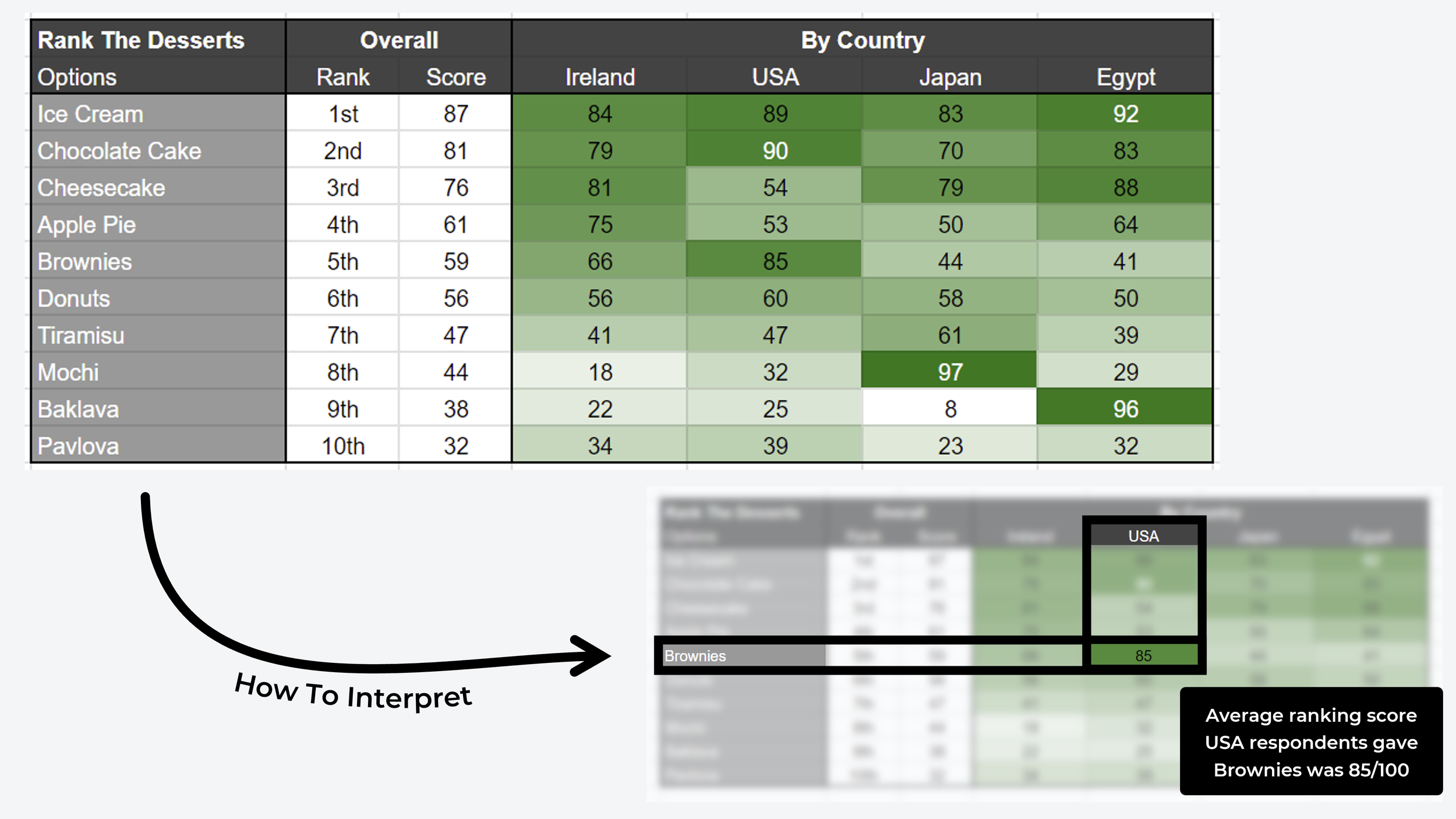
While crosstab is usually used for “categorical” data (like in the ice cream example), you can also use it as a comparison matrix to see how quantitative data differs across segments of people. The example below uses ranked data in a crosstab analysis to compare the favorite desserts of four different countries:

How To Create a Crosstab Table (Basic Spreadsheet Version)

In this section, I’ll share a step-by-step approach you can use to build your own crosstab analysis tables. The first example will follow a more traditional cross-tabulation approach in a Google Sheets spreadsheet. The second version is a more advanced matrix table for analyzing quantitative data.
A Traditional Crosstab Follows Four Steps:
1. Pick Your Questions → Pick the two survey questions you wish to compare and add the variables from each question to your matrix table as the row and column headers. It does not really matter which question goes where, but best practice is to put your identifying variables as columns and opinionated variables as rows.
2. Count Overlapping Variables → You can either do this manually, using a formula combo like COUNTIFS and VLOOKUP, eg. =COUNTIFS(A:A, "Chocolate", B:B, "Boy"), or using the spreadsheet’s built-in crosstab analysis feature.
3. Calculate Frequency Percentage → Focusing just on the column, calculate the percentage of entries that each row variable accounts for. The columns should add up to 100%. For example, in the crosstab screenshot, 5 of 25 boys picked strawberry as their favorite flavor, which accounts for 20% of boys.
4. Heatmap / Color Scale → Add conditional formatting to the percentage columns, with the lowest value set to white and the highest value showing as a solid color (in this case I chose blue). This allows you to spot outliers or strong correlations instantly at a glance.
Advantages of Crosstab Analysis (With Real Examples!)
The easiest way to explain the benefits of crosstab analysis is to use some real examples. For the most part, the examples I’ll be using are taken from real user research surveys and the screenshots are from the automated crosstab reports included in all OpinionX surveys.
1. Representative Samples
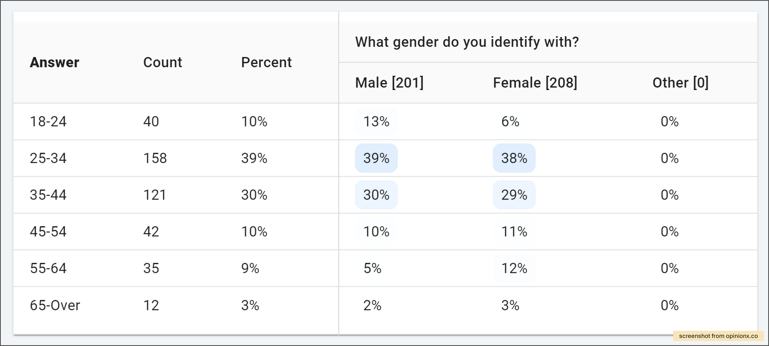
A crosstab table can help you quickly see whether your survey participants are well-balanced or if you’ve got one demographic group overrepresented in your results. For example, in the screenshot above, we have a crosstab with three “gender” columns and six “age bracket” rows. This table helps us quickly see that (i) we have a solid balance of male and female respondents across age categories, but (ii) young adults aged 25-44 are overrepresented in our participants so far compared to other age brackets (almost 70% are in the 25-44 range).

2. Flexible Format
Crosstab is not restricted to just categorical data. You can easily create a crosstab using other data types, like average scores for ranking questions. In the example above, a set of participants have ranked a list of concept candles, which each consist of an image and a caption. The crosstab shows a matrix comparison between the pairwise votes (ie. the percentage of pairs each candle was picked as the winner) and two segments — people who use decorative candles vs those that don’t. The results show that Lavender Dream is the highest-ranked option for both segments.

3. Identifying Outliers
Using heatmap-style color formatting on a cross tabulation helps us quickly see outliers in our results. For example, in the example above, we can see a list of “challenges” that have been ranked using Pairwise Comparison voting (a series of head-to-head votes where the score is the percentage of pair votes each option “won”). That dark-blue cell tells us that participants in the “other” gender group clearly picked the statement about “low confidence in social settings” way more often than male/female participants — and that this is an interesting outlier to dig deeper into!
4. Compare Groups
Some survey tools have filters for looking at how one specific group of people completed your survey — a great feature if you already know what participant groups matter most to you! Using a crosstab table, you can directly compare many groups in a single table so that differences jump right now, rather than trying to spot changes by looking at one filtered group at a time. In the crosstab example above, customers were asked to rank a list of reasons why they signed up for a product. We can see that there’s actually a statement that is WAY more interesting because it ranks highest for happy customers and lowest for unhappy users. This statement is much more interesting than the two that ranked higher overall — without our crosstab, we might have missed this interesting insight!
5. Stackable Variables
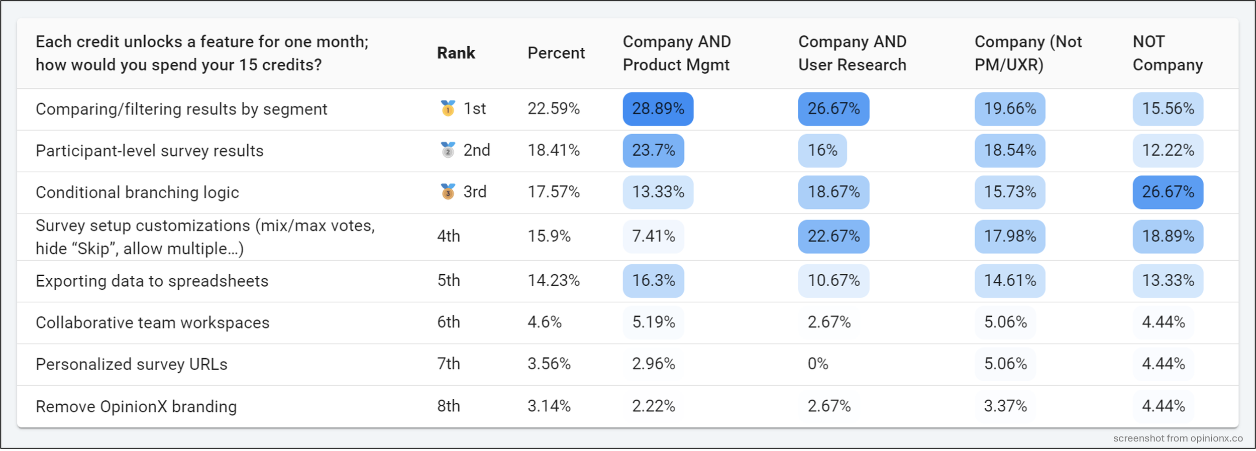
You can also create custom segments by combining variables using Boolean logical operators like AND/OR to stack multiple data points together. The example above is from a real customer research project I ran at OpinionX in late 2023 (full case study here). Looking at the four custom segments side by side, you can see that the score for the top-ranked option overall (“Comparing/filtering results by segment”) decreases in importance for each subsequent group. This insight was really important for us and helped us to clarify our unique value, sharpen our target customer profile, and inform our entire 2024 company strategy — that’s the power of a good crosstab analysis!
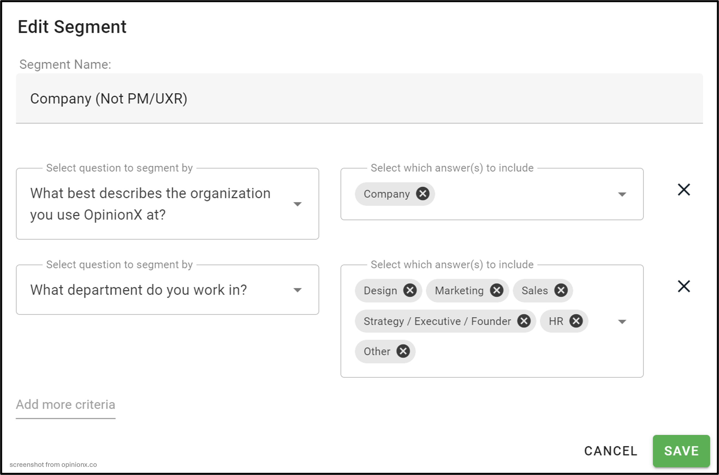
Those groups were each custom-configured using data from multiple questions using OpinionX’s Saved Segments feature, as pictured below. Each row below forms an AND statement, with each answer in a row tied together by OR logic. This could be explained as only picking participants that had selected “Company AND (Design OR Marketing OR Sales OR Strategy…)”. These stacked variables are great for creating crosstabs with customer data, where you want to consider things like pricing plan, account size, usage frequency, and other common data points.
Crosstabs don’t have to be a scary advanced analysis format. They are flexible (whether doing a simple demographic breakdown, stacking multiple variables together, or using quantitative datasets like ranked scores), intuitive (percentages and heatmap color formatting make insights jump out), and automated (if you use a survey tool like OpinionX which creates crosstab reports automatically for you!).
Use Cases: When To Use Crosstab Analysis
Cross Tabulation is a useful analysis method whenever you’ve got two or more categories of data you want to compare against one another. Here are some example scenarios where crosstab analysis is particularly valuable…
Market Segmentation → Crosstab is one of the most powerful analysis tools you can use during customer or market segmentation research. It allows you to quickly map all possible segments in a simple table and visually compare them, helping you spot outlier segments of customers that think differently from the rest of your market.
Feature Usage → Create a crosstab with customer firmographics (eg. industry, title, pricing plan) as the columns and feature usage as the rows. This will show you which features are most used why specific types of users, helping you better understand the “jobs” that customers are hiring your product to accomplish or areas of functionality that are not being used by your key customers.
Roadmap Prioritization → Whether you’re asking users to vote on problem statements in pairs or rank feature ideas, it’s essential to use crosstab analysis to see how different customer segments prioritize needs. Every quarterly roadmap survey we run ends up in a crosstab so that I can see which opportunities are most aligned with specific customer segments.
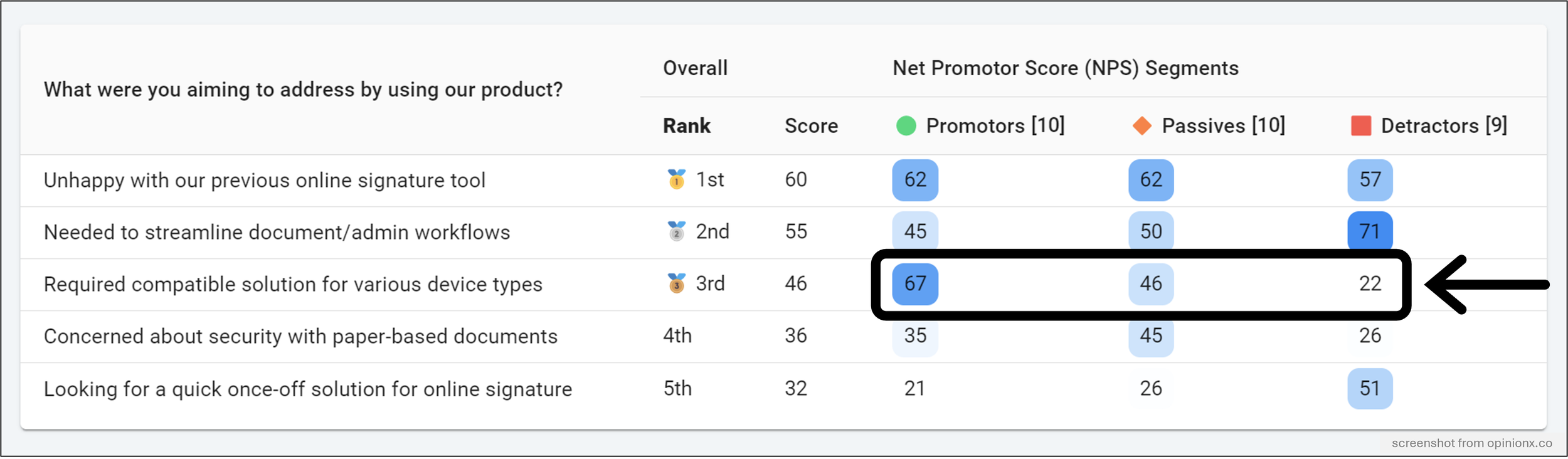
Net Promoter Score → The real value in NPS surveys is always always always found in segmented results. Bringing your three NPS categories (Promoters, Passives, and Detractors) into a crosstab helps you better understand what is driving customer loyalty for Promoters while isolating the barriers to activation and adoption that are harming your ability to sustain continued growth.
Needs Assessment → After conducting a needs-based segmentation or psychographic segmentation study, bring your survey data into a crosstab to identify customer segments that care about specific needs/pains more than others, or compare the survey data against product usage data to identify the problems that your most engaged customers care most about solving.
Customer Satisfaction → Similar to NPS surveys, CSAT research is never complete without some form of segmentation analysis. Crosstab is an ideal way to see how your survey results are different at each level of customer satisfaction so that your survey insights can be used to both extend what you’re already doing well while also understanding what you’re underperforming on.
Employee Engagement → Whether you’re running a simple employee pulse survey or a more advanced culture assessment, crosstab is a great way to analyze the differences in perceived employee experience for different departments, levels of seniority, or years employed. Those granular insights, which can be obtained from a single cross-tabulation report, will allow you to generate targeted strategies for improving employee experience rather than chasing vague company-level objectives.
Customer Feedback → Analyzing how perceptions of service quality vary by the type of service received (AI chatbot -v- phone call -v- email thread -v- in-person support).
— — —
How To Create A Crosstab From Survey Data Results (Reviewing 9 Different Tools / Methods)
I did a deep dive into the most popular survey tools to figure out:
Which tools offer crosstab features for survey analysis?
How expensive is it to access their crosstab functionality?
Are there any limitations or restrictions on their crosstab reports?

1. OpinionX
OpinionX is a survey tool that specializes in ranking people’s preferences and priorities. It offers a range of ranking methods (like pairwise comparison, ranked choice voting, points-based ranking, and more) along with automated segmentation and crosstab analysis. OpinionX is used by tens of thousands of teams (including teams at Disney, LinkedIn, and GitHub) to better understand what their customers and employees care about most.

i. Automated Analysis → Crosstab tables on OpinionX are populated automatically. Now when some people say “automatically” they mean you still have to do loads of setup work, but I really mean automatically. On OpinionX’s results page, you’ll find a tab called “Segments” that comes preset with one crosstab table for each question in your survey.
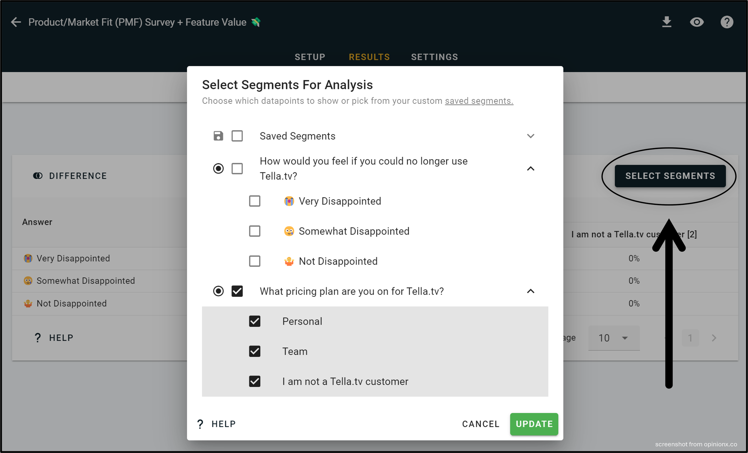
ii. Easily Edit → Changing the variables on your crosstab is so easy on OpinionX. Just click the “Select Segments” button on the corner of any crosstab and you’ll get a simple popup menu where you can choose which data to include or exclude. There’s also a Saved Segments feature for creating custom groups of survey participants using AND/OR logic to combine answers from multiple survey questions.

^ This crosstab example shows the part-worth utility scores for a conjoint analysis survey about smartphone buyer preferences, where we can see a clear rivalry between iPhone and Android owners and a higher price sensitivity amongst Android users.
iii. Multiple Question Formats → Unlike all the other tools in this list, crosstabs on OpinionX are compatible with all question types. That includes not just Multiple Choice, but also Rating Scale, Pairwise Comparison, Image Voting, Points Ranking, MaxDiff Analysis, Ranked Choice Voting, Conjoint Analysis, and Consensus Ballots, and more. When you create a survey on OpinionX using one of these question types, you’ll have a crosstab table automatically generated on your Segments Tab waiting for you!

iv. Readily Affordable → Not only does OpinionX have the easiest to use crosstab analysis functionality and the broadest question-type compatibility, it also offers the lowest price for crosstab reports of any survey tool — unlock crosstab reports and other analysis methods like segmentation and persona clustering for just $20/month (4x less than any other survey tool).
OpinionX is the cheapest, easiest to use, and most widely compatible survey tool for crosstab analysis. Not convinced? Every account on OpinionX comes with a range of pre-populated sample surveys with all analysis features unlocked for you to test for yourself. Create a free account now and check out the OpinionX Sample Surveys Gallery.
— — —
2. Manual Spreadsheet
It’s pretty easy to create crosstabs in Google Sheets or Excel, if your data is categorical (eg. answers to a multiple choice question). Here are the steps I use to create a crosstabulation in Google Sheets (alternative tutorial for Excel here).

Step 1: Add Your Data → I’ve exported data from a Product/Market Fit Survey on OpinionX and uploaded it to a new Google Sheets document.

Step 2: Insert Pivot Table → Highlight all your data, open the “Insert” dropdown menu, and choose Pivot Table (New Sheet).

Step 3: Configure Values → Drag and drop your two data points into the areas for the Rows and Columns variables, along with one of the two in the Values variable.
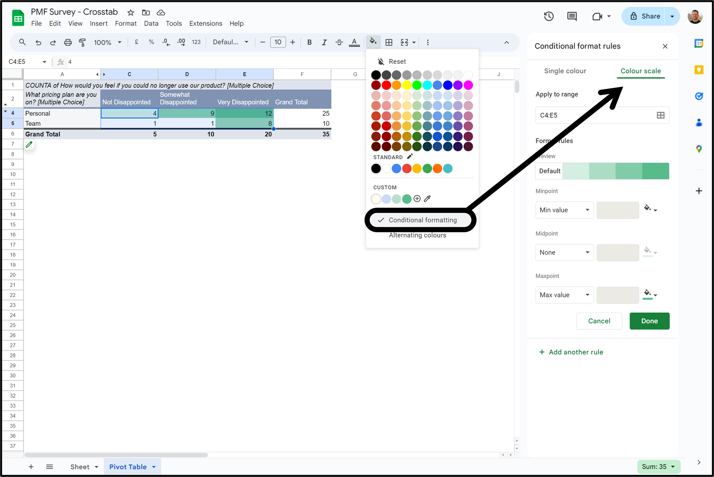
Step 4: Heatmap Formatting → To apply heatmap color coding, highlight your number values (if your crosstab is count-based rather than percentages, make sure and exclude the “Total” rows from this), open the fill color menu, click “Conditional Formatting”, and switch it to the “Color Scale” option.
Done! That’s how you create a simple crosstab using categorical survey data in a spreadsheet tool like Google Sheets.
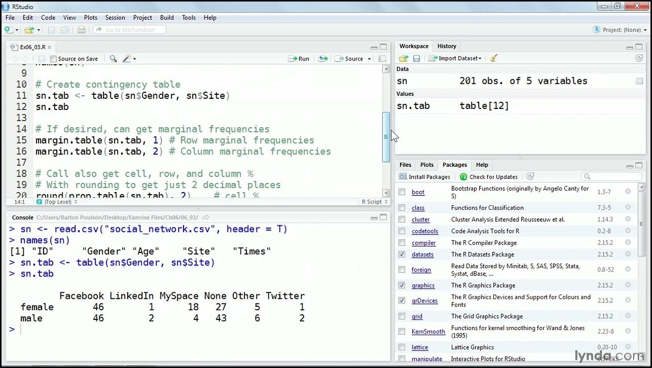
3. R
R is a programming language that statisticians use for analyzing data and creating graphics. You don’t need to be an advanced statistician to create a survey results crosstab in R, but you’ll need a basic understanding of R, its syntax, and access to a software product that supports it. If you’re starting from scratch, you should be able to get up and running with basic data structures, functions, and packages like Dplyr in under 1-2 weeks. It’s a great skill to learn as R is open-source, free to use, and can be used for a wide range of data types and complex analyses.
For more info on creating crosstabs in R, I’d recommend checking out a guide created by someone with more knowledge in this topic, such as this one → Crosstab calculation in R by DatScienceTut.com.
4. Typeform
There is no crosstab functionality on Typeform. According to Typeform’s community manager, you’ll have to export your data to an external spreadsheet and manually create your own cross tabulation there.
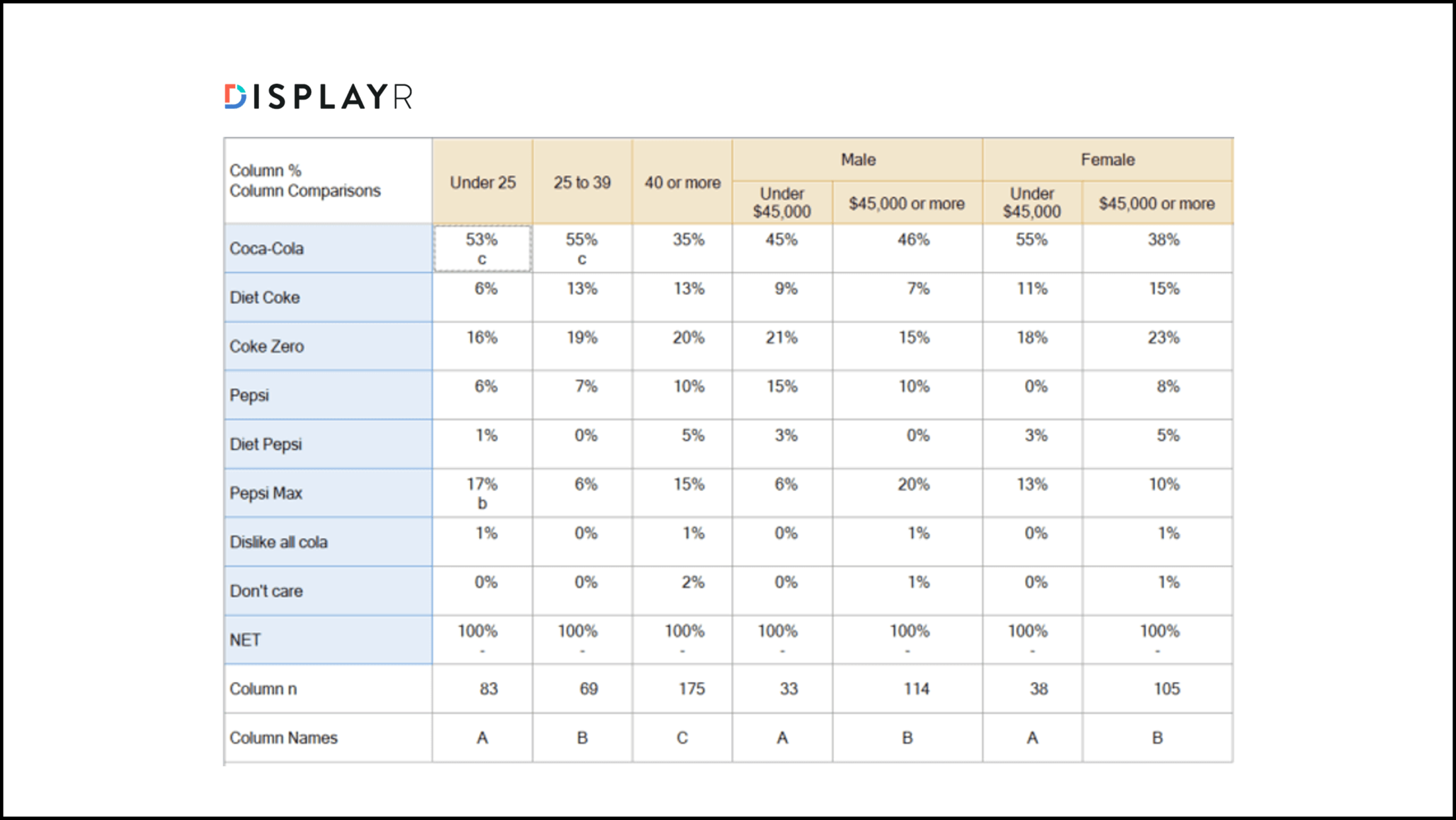
5. Displayr
Displayr is a data analysis tool — it allows you to take your survey results from a tool like Typeform, which doesn’t really include any analysis features at all, and create custom dashboards, charts, and reports. Cross-tabulation is part of Displayr’s $480/year “Data Stories” pricing module, which is separate from the core Displayr product. If you’re looking to bring your existing survey data into a purpose-built analysis tool, then Displayr’s Data Stories product is likely what you need — more info here.
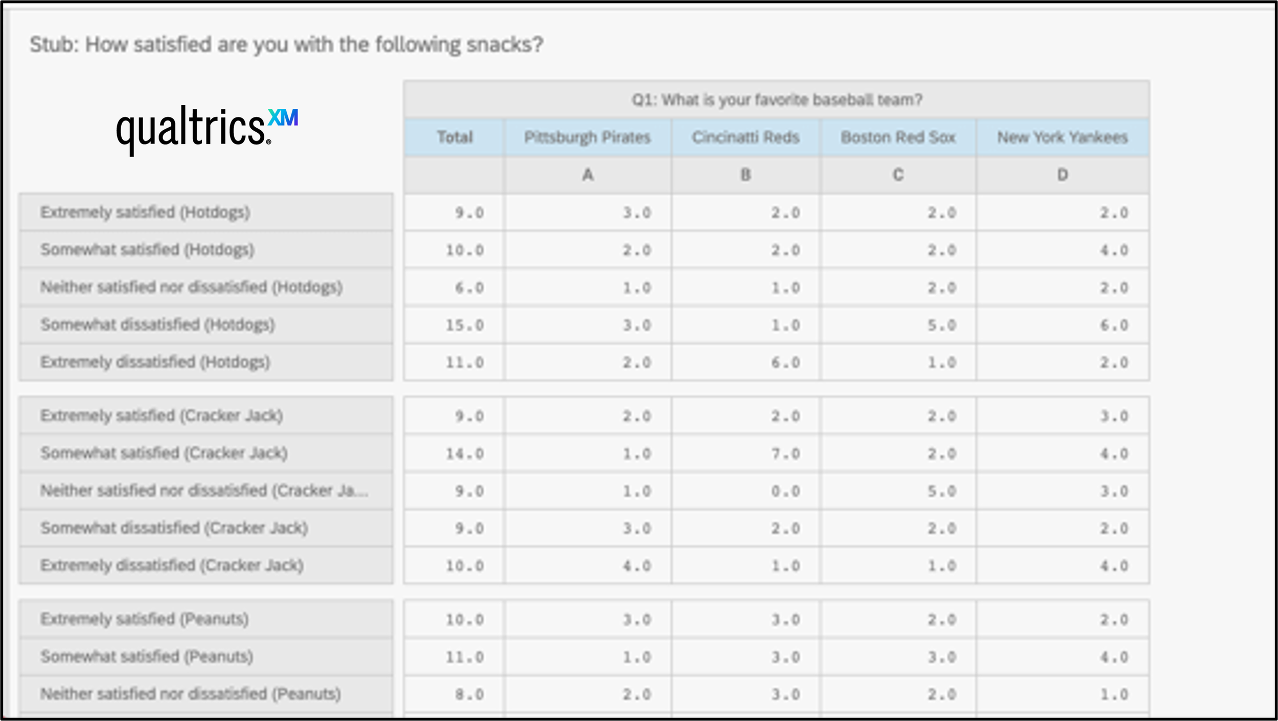
6. Qualtrics
Crosstab analysis is not included in QualtricsXM subscriptions. As of early 2021, Qualtrics repackaged crosstabs so that it is included only with the purchase of StatsIQ, meaning that even some paid licenses for QualtricsXM may not include crosstab analysis functionality. Additionally, crosstabs on Qualtrics do not work with MaxDiff or Conjoint Analysis questions.
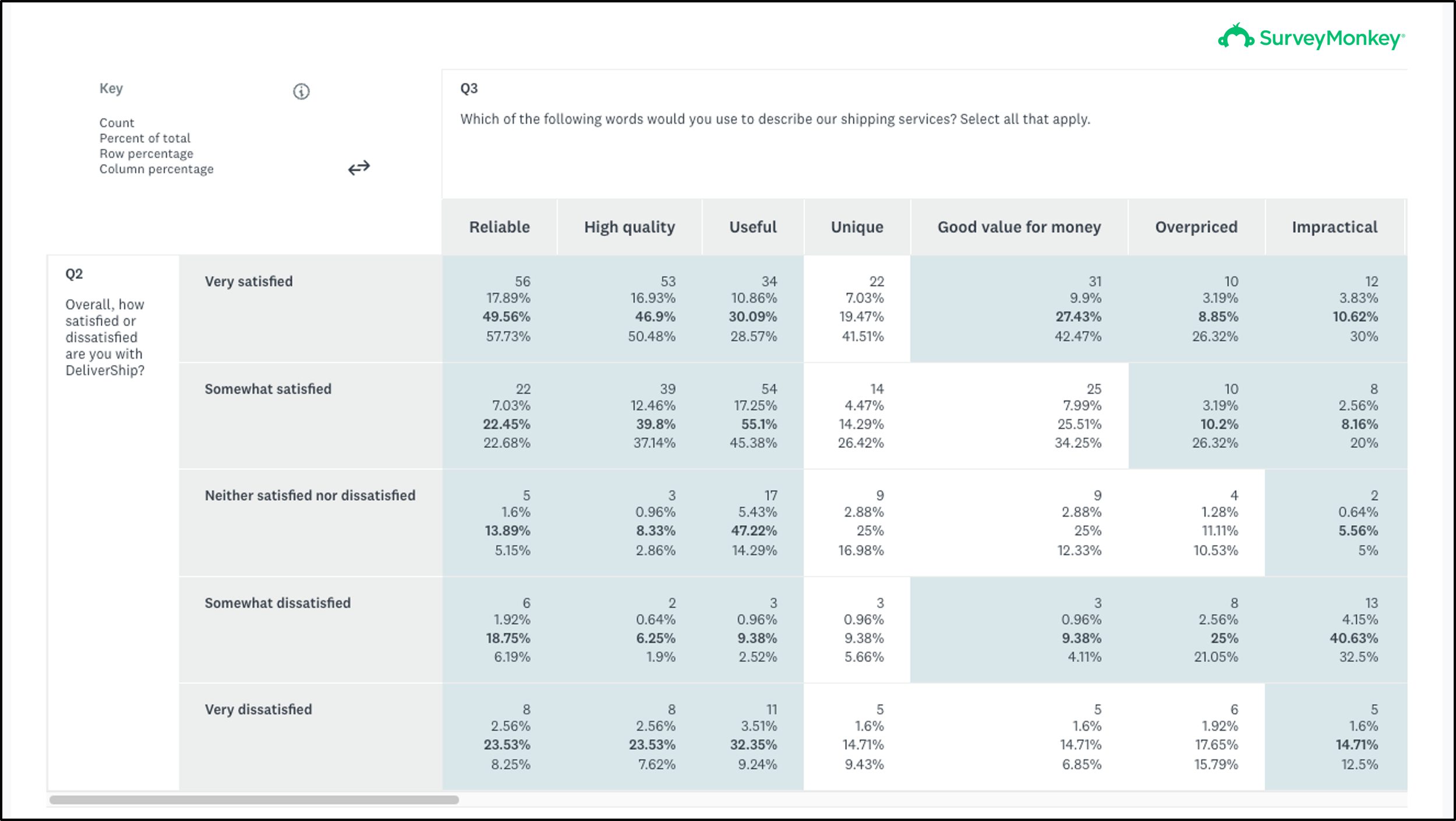
7. SurveyMonkey
While SurveyMonkey does have a cross-tabulation reporting format, it is only compatible with Multiple Choice questions — 85% of SurveyMonkey question formats are not able to be displayed in a crosstabulation (including rating scales, sliders, ranking questions, maxdiff “best/worst” scales, matrix questions, and others are not compatible). SurveyMonkey’s crosstab reports are available on their “Premier” tier (its most expensive self-service pricing option). Premier Individual costs $1188/year and the Premier Team version starts at $2700/year plus $900 per additional user.
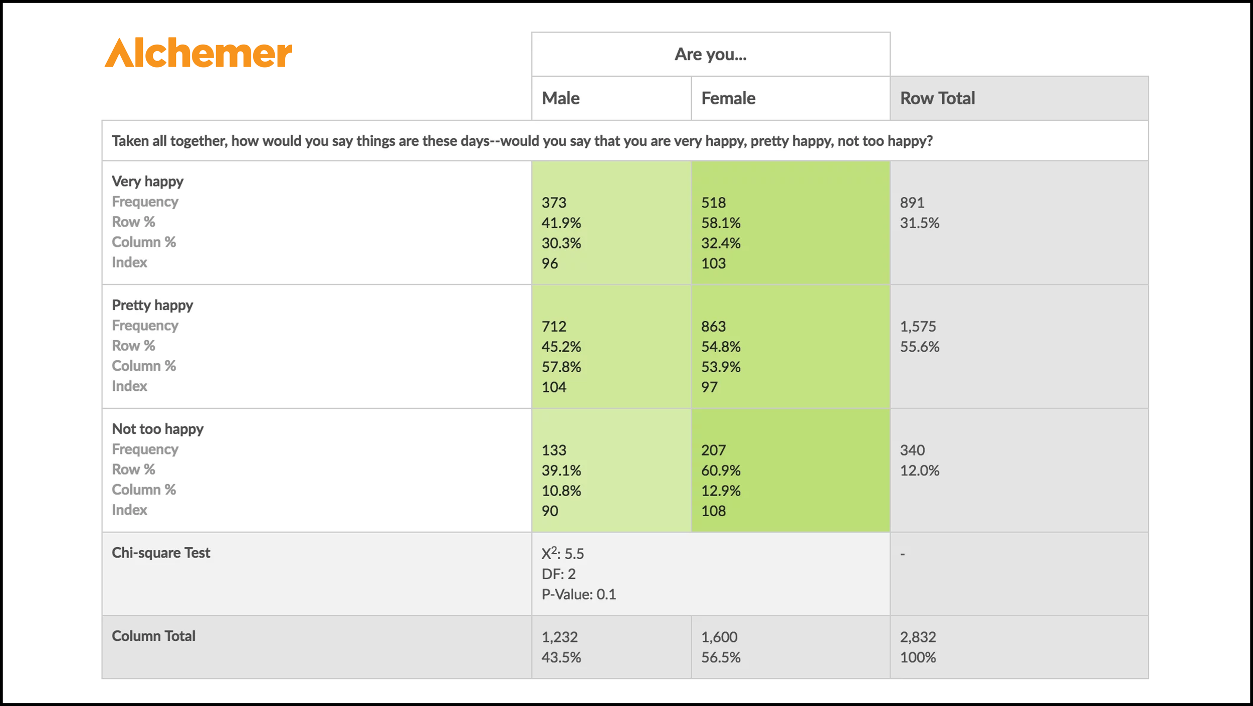
8. Alchemer
Unfortunately, crosstab reports are only available on enterprise plans for Alchemer, which must be custom-negotiated with Alchemer’s sales team. Alchemer does offer a couple of extra compatible question types for crosstab compared to SurveyMonkey — as well as choice/selection-based questions, it lets you use rating scale questions and URL variables too. If you are willing to procure an enterprise contract, the good news is that Alchemer’s crosstab reports come with some advanced features such as scoring for Pearson Chi-Square, degrees of Freedom, P-Value, and Fisher’s Exact Test.

9. QuestionPro
Crosstab analysis is available on QuestionPro’s paid survey plans — either the Advanced tier ($1188/year for one person) or Team tier (starts at $4980/year for a minimum of five seats). These paid tiers, however, only include a basic count-based crosstab (count, average, percentage). To use heatmap color formatting or statistical analysis, you must upgrade to their “Research Edition” enterprise plan (minimum starting price of $10,000/year).
— — —
Technical Jargon: The Crosstab Dictionary
Crosstab -v- Matrix -v- Contingency Table
You’ll often see crosstab analysis referred to as either Cross Tabulation or Contingency Tables. That’s because they both mean the same thing. “Crosstab” tends to be used in commercial scenarios like like market research, user research, or political polling, whereas “Contingency Tables” is more commonly used in formal settings like academic research. Both are matrices — a table of numbers represented across an array of rows and columns.
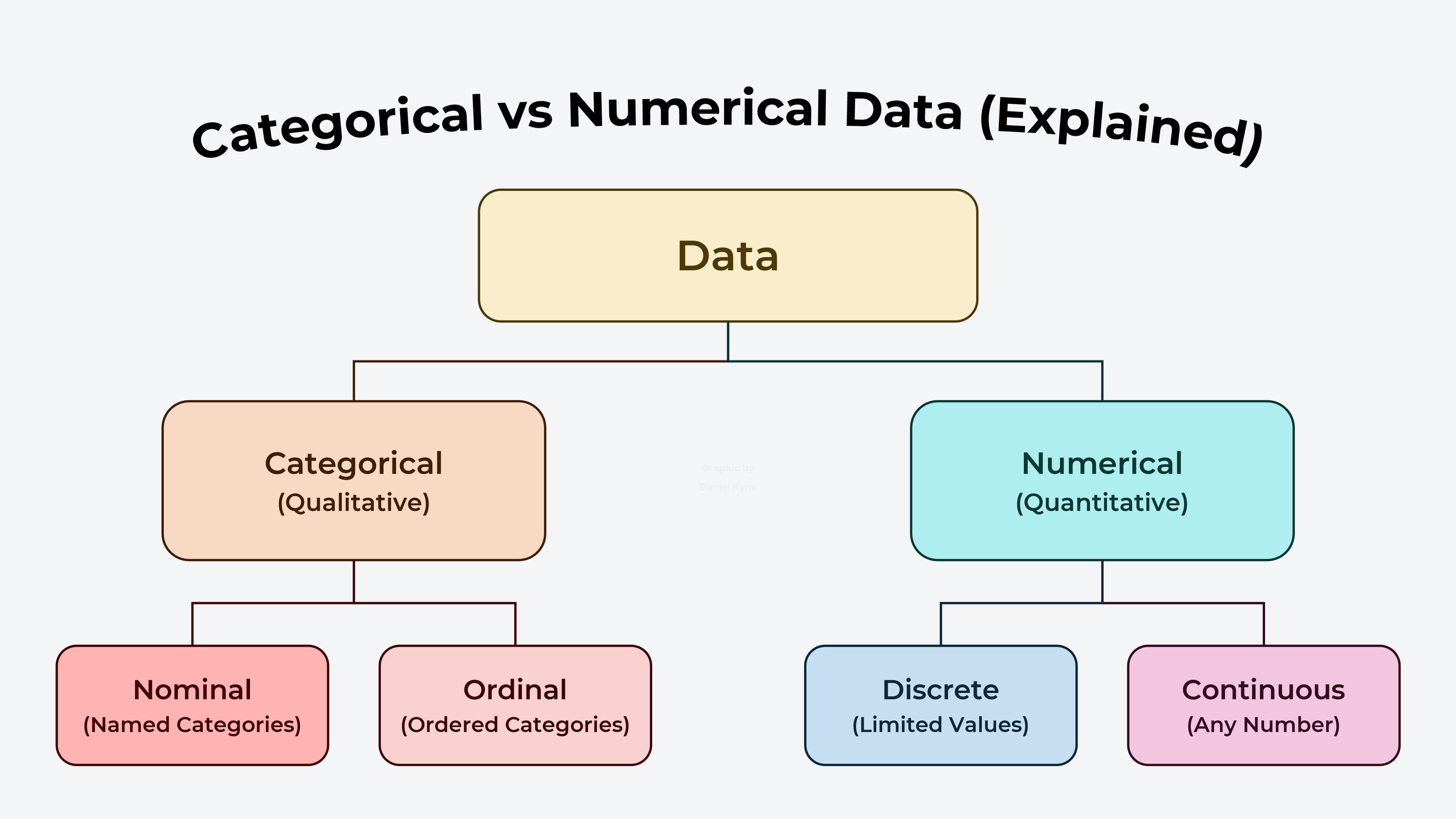
Categorical vs Numerical Data
Almost every guide on the internet says that crosstab analysis only works on categorical data, but there is no reason to continue perpetuating this unnecessary restriction. As long as crosstabs are matrices where any given cell represents the overlap between the row variable and column variable, then it is a suitable analysis format. This means that you can use crosstabs to show average scores of rating scales or ranking exercises for each segment of survey respondents, for example.
^ Example of a crosstab matrix table that uses average scores from a pairwise comparison ranking survey (ie. non-categorical crosstabulation!)
Basic Crosstab Terminology
When describing a crosstab table, rows are known as “stubs” and columns as “banners” or “cuts”.
A grouped set of variables are called a “category”, for example in a survey question where people picked their age from a set of ranges (eg. 18-24, 25-34, 35-44…), this collection of variables is called a “category”.
The value of each cell in a crosstab tends to be either a “count” (also known as “frequency”) in which you add up the number of times that your two variables appeared together in a participant profile, or a “percentage”.
You can use “filters” to focus your crosstab on a particular view of your data.
A “pivot table” is a format used to summarize and manipulate data in a spreadsheet. It is commonly used as the basis for crosstabs in tools like Excel.
A “CSV” (acronym for comma-separated values) is a text file format that uses commas to separate values, and newlines to separate records — it’s basically like a text-only version of a spreadsheet. It’s common to populate a crosstab using data that comes from a CSV file.
To figure out whether the results of our cross tab could’ve happened by chance or is the result of an underlying relationship between our variables, we would test our data to see if it is “statistically significant” (ie. an underlying relationship exists).
Advanced Crosstab Terminology
The “Pearson Chi-Square Test” is a type of analysis used to determine whether two variables in a crosstab are independent or have a statistically significant relationship by measuring the actual data (eg. survey results) against the expected data (eg. population data).
“Degrees of Freedom” (also known as “DF”) refers to the number of independent pieces of information used in the calculation of a statistical test such as the Pearson Chi-Square Test.
“P-Value” is a common statistical measure that calculates the level of confidence that the two variables or categories in your crosstab are correlated.
— — —
Most survey tools charge thousands of dollars to access crosstabs that are burdened with format limitations and outdated interfaces. OpinionX automatically generates crosstab reports for all surveys, requiring no technical configuration while also allowing more advanced designs where required. It’s the perfect blend of easy to use, available for deep analysis, and more affordable than any other tool.
Create a survey on OpinionX today and leverage the industry’s best survey crosstab functionality for your next research project.
— — —
Enjoyed this blog post? Thousands of founders and product teams subscribe to our newsletter, The Full-Stack Researcher, for actionable user research advice just like this:
About The Author:
Daniel Kyne is the Co-Founder of OpinionX, a free research tool for stack ranking people’s priorities — used by thousands of product teams to better understand what matters most to their customers. OpinionX comes with a bunch of research methods for measuring people’s preferences — including automated crosstab analysis reports for a range of survey methods. Try it now!